---
title: Capacitor Action Sheet Plugin for Android & iOS
description: Capacitor plugin to present native action sheets with styled and destructive buttons on Android and iOS.
tags:
- Android
- iOS
search:
boost: 2
faq: true
status: new
github_repo: capawesome-team/capacitor-plugins
npm_package: "@capawesome/capacitor-action-sheet"
---
# Capacitor Action Sheet Plugin
Capacitor plugin for native action sheets.
## Features
- 📋 **Action Sheet**: Present a native action sheet with a list of buttons.
- 🎨 **Button Styles**: Highlight destructive actions and pin a cancel button.
- 📝 **Title & Message**: Show a title and message on both Android and iOS.
- 📱 **iPad Ready**: Automatically anchored as a popover on iPad.
- 🔒 **App Store safe**: Uses only official platform APIs.
- 🤝 **Compatibility**: Works alongside the [Dialog](https://capawesome.io/docs/sdks/capacitor/dialog/) plugin.
- 📦 **CocoaPods & SPM**: Supports CocoaPods and Swift Package Manager for iOS.
- 🔁 **Up-to-date**: Always supports the latest Capacitor version.
Missing a feature? Just [open an issue](https://github.com/capawesome-team/capacitor-plugins/issues) and we'll take a look!
## Use Cases
The Action Sheet plugin is typically used to let the user choose between several actions in a native way, for example:
- **Contextual item actions**: Show options such as upload, share, or delete when the user taps an item in a list.
- **Destructive confirmations**: Highlight irreversible actions like deleting a photo using the destructive button style.
- **Photo source selection**: Ask the user whether to take a new photo or pick an existing one before opening the camera.
- **Cancelable flows**: Pin a cancel button to the sheet so the user can always back out of an action.
## Compatibility
| Plugin Version | Capacitor Version | Status |
| -------------- | ----------------- | -------------- |
| 0.x.x | >=8.x.x | Active support |
## Demo
| Android | iOS |
| -------------------------------------------------------------------------------------------------------------------------------------------------------------------------------- | ------------------------------------------------------------------------------------------------------------------------------------------------------------------------ |
| 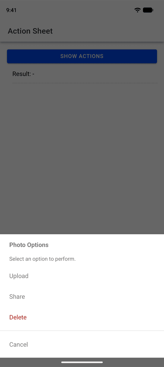 |
| 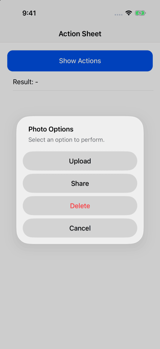 |
## Installation
You can use our **AI-Assisted Setup** to install the plugin.
Add the [Capawesome Skills](https://github.com/capawesome-team/skills) to your AI tool using the following command:
```bash
npx skills add capawesome-team/skills --skill capacitor-plugins
```
Then use the following prompt:
```
Use the `capacitor-plugins` skill from `capawesome-team/skills` to install the `@capawesome/capacitor-action-sheet` plugin in my project.
```
If you prefer **Manual Setup**, install the plugin by running the following commands and follow the platform-specific instructions below:
```bash
npm install @capawesome/capacitor-action-sheet
npx cap sync
```
### Android
#### Variables
This plugin will use the following project variables (defined in your app's `variables.gradle` file):
- `$androidxMaterialVersion` version of `com.google.android.material:material` (default: `1.12.0`)
### iOS
No additional configuration is required for this plugin.
## Configuration
No configuration required for this plugin.
## Usage
The following example shows how to present a native action sheet and read the selected button.
### Show an action sheet
Present a native action sheet with a title, a message, and a list of buttons. Use `ActionSheetButtonStyle.Destructive` to highlight irreversible actions and `ActionSheetButtonStyle.Cancel` to pin a cancel button. The result contains the zero-based index of the selected button. If the user selects the cancel button or dismisses the action sheet, the promise is rejected with the `CANCELED` error code. Only available on Android and iOS:
```typescript
import { ActionSheet, ActionSheetButtonStyle, ErrorCode } from '@capawesome/capacitor-action-sheet';
const showActions = async () => {
try {
const { index } = await ActionSheet.showActions({
title: 'Photo Options',
message: 'Select an option to perform.',
options: [
{ title: 'Upload' },
{ title: 'Share' },
{ title: 'Delete', style: ActionSheetButtonStyle.Destructive },
{ title: 'Cancel', style: ActionSheetButtonStyle.Cancel },
],
});
console.log('Index:', index);
} catch (error) {
if (error.code === ErrorCode.Canceled) {
console.log('The user canceled the action sheet.');
}
}
};
```
## API
* [`showActions(...)`](#showactions)
* [Interfaces](#interfaces)
* [Enums](#enums)
### showActions(...)
```typescript
showActions(options: ShowActionsOptions) => Promise
```
Show an action sheet with a list of buttons.
If the user selects a button with the `ActionSheetButtonStyle.Cancel` style
or dismisses the action sheet, the promise is rejected with the `CANCELED`
error code.
Only available on Android and iOS.
| Param | Type |
| ------------- | ----------------------------------------------------------------- |
| **`options`** |
|
## Installation
You can use our **AI-Assisted Setup** to install the plugin.
Add the [Capawesome Skills](https://github.com/capawesome-team/skills) to your AI tool using the following command:
```bash
npx skills add capawesome-team/skills --skill capacitor-plugins
```
Then use the following prompt:
```
Use the `capacitor-plugins` skill from `capawesome-team/skills` to install the `@capawesome/capacitor-action-sheet` plugin in my project.
```
If you prefer **Manual Setup**, install the plugin by running the following commands and follow the platform-specific instructions below:
```bash
npm install @capawesome/capacitor-action-sheet
npx cap sync
```
### Android
#### Variables
This plugin will use the following project variables (defined in your app's `variables.gradle` file):
- `$androidxMaterialVersion` version of `com.google.android.material:material` (default: `1.12.0`)
### iOS
No additional configuration is required for this plugin.
## Configuration
No configuration required for this plugin.
## Usage
The following example shows how to present a native action sheet and read the selected button.
### Show an action sheet
Present a native action sheet with a title, a message, and a list of buttons. Use `ActionSheetButtonStyle.Destructive` to highlight irreversible actions and `ActionSheetButtonStyle.Cancel` to pin a cancel button. The result contains the zero-based index of the selected button. If the user selects the cancel button or dismisses the action sheet, the promise is rejected with the `CANCELED` error code. Only available on Android and iOS:
```typescript
import { ActionSheet, ActionSheetButtonStyle, ErrorCode } from '@capawesome/capacitor-action-sheet';
const showActions = async () => {
try {
const { index } = await ActionSheet.showActions({
title: 'Photo Options',
message: 'Select an option to perform.',
options: [
{ title: 'Upload' },
{ title: 'Share' },
{ title: 'Delete', style: ActionSheetButtonStyle.Destructive },
{ title: 'Cancel', style: ActionSheetButtonStyle.Cancel },
],
});
console.log('Index:', index);
} catch (error) {
if (error.code === ErrorCode.Canceled) {
console.log('The user canceled the action sheet.');
}
}
};
```
## API
* [`showActions(...)`](#showactions)
* [Interfaces](#interfaces)
* [Enums](#enums)
### showActions(...)
```typescript
showActions(options: ShowActionsOptions) => Promise
```
Show an action sheet with a list of buttons.
If the user selects a button with the `ActionSheetButtonStyle.Cancel` style
or dismisses the action sheet, the promise is rejected with the `CANCELED`
error code.
Only available on Android and iOS.
| Param | Type |
| ------------- | ----------------------------------------------------------------- |
| **`options`** | ShowActionsOptions |
**Returns:** Promise<ShowActionsResult>
**Since:** 0.1.0
--------------------
### Interfaces
#### ShowActionsResult
| Prop | Type | Description | Since |
| ----------- | ------------------- | --------------------------------------------------------------------- | ----- |
| **`index`** | number | The index of the selected button in the `options` array (zero-based). | 0.1.0 |
#### ShowActionsOptions
| Prop | Type | Description | Default | Since |
| ---------------- | -------------------------------- | ------------------------------------------------------------------------------------------------------------------------------------------------------------------------------------------------------------------------------------------------------------------------------------------------------------------ | ----------------- | ----- |
| **`cancelable`** | boolean | Whether the action sheet can be dismissed by tapping outside of it or pressing the back button. On iOS, this is a system behavior: on iPhone, tapping outside dismisses the action sheet only if it has a button with the `Cancel` style. On iPad, tapping outside always dismisses it. Only available on Android. | true | 0.1.0 |
| **`message`** | string | The message to display below the title. | | 0.1.0 |
| **`options`** | ActionSheetButton[] | The buttons to display in the action sheet. | | 0.1.0 |
| **`title`** | string | The title of the action sheet. | | 0.1.0 |
#### ActionSheetButton
| Prop | Type | Description | Default | Since |
| ----------- | ------------------------------------------------------------------------- | ------------------------ | ------------------------------------------- | ----- |
| **`style`** | ActionSheetButtonStyle | The style of the button. | ActionSheetButtonStyle.Default | 0.1.0 |
| **`title`** | string | The title of the button. | | 0.1.0 |
### Enums
#### ActionSheetButtonStyle
| Members | Value | Description | Since |
| ----------------- | -------------------------- | -------------------------------------------------------------------------------------------- | ----- |
| **`Cancel`** | 'CANCEL' | A button that cancels the action sheet. It should be the last button in the `options` array. | 0.1.0 |
| **`Default`** | 'DEFAULT' | A button with the default style. | 0.1.0 |
| **`Destructive`** | 'DESTRUCTIVE' | A button that indicates a destructive action. | 0.1.0 |
## Migrating from `@capacitor/action-sheet`
This plugin is largely API-compatible with the official [`@capacitor/action-sheet`](https://github.com/ionic-team/capacitor-plugins/tree/main/action-sheet) plugin. The `ActionSheetButtonStyle` enum uses the same values (`DEFAULT`, `DESTRUCTIVE`, `CANCEL`), so no enum changes are required. The following differences apply:
| `@capacitor/action-sheet` | `@capawesome/capacitor-action-sheet` |
| ----------------------------------------------- | ------------------------------------------------------ |
| `showActions({ title, message, options })` | `showActions({ title, message, options, cancelable })` |
| Cancel button resolves with its `index` | Cancel button rejects with the `CANCELED` error code |
| `message` and button styles ignored on Android | `message` and button styles rendered on Android |
| `cancelable` not available | `cancelable` (default `true`) |
## FAQ
### How is this plugin different from other similar plugins?
It presents the platform's own native action sheet on Android and iOS through a fully typed API, rendering the title, message, and button styles — including destructive and cancel styles — consistently on both platforms, and automatically anchoring as a popover on iPad. The result reports the selected button index, a cancellation rejects the promise with the `CANCELED` error code, and the `cancelable` option controls dismissal, all using only official platform APIs. Actively maintained against the latest Capacitor version, it lets a single dependency cover the whole action-sheet story.
### On which platforms can I show an action sheet?
The `showActions(...)` method is only available on Android and iOS, where it presents the native action sheet of the respective platform. On iPad, the action sheet is automatically anchored as a popover.
### How do I know which button the user selected?
The result of `showActions(...)` contains the zero-based `index` of the selected button in the `options` array. If the user selects a button with the `ActionSheetButtonStyle.Cancel` style or dismisses the action sheet, the promise is rejected with the `CANCELED` error code instead.
### Can the user dismiss the action sheet without selecting a button?
Yes. On Android, the action sheet can be dismissed by tapping outside of it or pressing the back button unless you set the `cancelable` option to `false`. On iOS, the `cancelable` option has no effect: on iPhone, tapping outside dismisses the action sheet only if it has a button with the `ActionSheetButtonStyle.Cancel` style, while on iPad, tapping outside always dismisses it. If the action sheet is dismissed, the promise is rejected with the `CANCELED` error code.
### How is this plugin different from the official Capacitor Action Sheet plugin?
This plugin is largely API-compatible with the official `@capacitor/action-sheet` plugin and uses the same `ActionSheetButtonStyle` enum values. In addition, it renders the message and button styles on Android, rejects with the `CANCELED` error code when the user cancels, and supports the `cancelable` option. See the [migration section](#migrating-from-capacitoraction-sheet) for a detailed comparison.
### Can I use this plugin together with the Capawesome Dialog plugin?
Yes, the plugin is designed to work alongside the [Dialog](https://capawesome.io/docs/sdks/capacitor/dialog/) plugin. Use an action sheet when the user has to choose between several actions, and a dialog for alerts, confirmations, and text input.
### Can I use this plugin with Ionic, React, Vue or Angular?
Yes, the plugin is framework-agnostic. It works in any Capacitor app regardless of the web framework, including Ionic with Angular, React, or Vue, as well as plain JavaScript projects.
## Related Plugins
- [Dialog](https://capawesome.io/docs/sdks/capacitor/dialog/): Display native alert, confirm, and prompt dialogs.
- [Haptics](https://capawesome.io/docs/sdks/capacitor/haptics/): Provide haptic feedback such as impacts, notifications, and vibrations.
- [Toast](https://capawesome.io/docs/sdks/capacitor/toast/): Show native toast notifications.
## Newsletter
Stay up to date with the latest news and updates about the Capawesome, Capacitor, and Ionic ecosystem by subscribing to our [Capawesome Newsletter](https://cloud.capawesome.io/newsletter/).
## Changelog
See [CHANGELOG.md](https://github.com/capawesome-team/capacitor-plugins/blob/main/packages/action-sheet/CHANGELOG.md).
## License
See [LICENSE](https://github.com/capawesome-team/capacitor-plugins/blob/main/packages/action-sheet/LICENSE).
