---
title: Capacitor Tab Bar Plugin for iOS
description: Capacitor plugin to display a native iOS tab bar with Liquid Glass over the web view, with SF Symbols, badges and launch configuration. iOS only.
tags:
- iOS
search:
boost: 2
faq: true
status: new
github_repo: capawesome-team/capacitor-plugins
npm_package: "@capawesome/capacitor-tab-bar"
---
# Capacitor Tab Bar Plugin
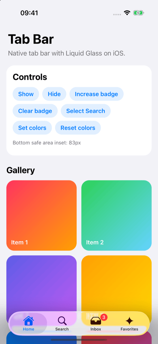
Capacitor plugin to display a native [tab bar](https://developer.apple.com/documentation/uikit/uitabbar) with Liquid Glass on iOS.

## Features
- 🫧 **Liquid Glass**: Renders the native Liquid Glass tab bar on iOS 26 and the classic tab bar on earlier versions.
- 🧭 **Tabs**: Use SF Symbols or images from your asset catalog as icons and show badges.
- 🎨 **Colors**: Customize the colors of the selected and unselected tabs.
- 📐 **Safe area**: Extends the bottom safe area inset of the web view, so your content is never covered by the tab bar.
- 🚀 **Launch configuration**: Show the tab bar from launch without waiting for your web app.
- 📦 **CocoaPods & SPM**: Supports CocoaPods and Swift Package Manager for iOS.
- 🔁 **Up-to-date**: Always supports the latest Capacitor version.
Missing a feature? Just [open an issue](https://github.com/capawesome-team/capacitor-plugins/issues) and we'll take a look!
## Compatibility
| Plugin Version | Capacitor Version | Status |
| -------------- | ----------------- | -------------- |
| 0.x.x | >=8.x.x | Active support |
## Demo
| iOS |
| -------------------------------------------------------------------------------------------------------------------------------------------------------------- |
|  |
## Installation
You can use our **AI-Assisted Setup** to install the plugin.
Add the [Capawesome Skills](https://github.com/capawesome-team/skills) to your AI tool using the following command:
```bash
npx skills add capawesome-team/skills --skill capacitor-plugins
```
Then use the following prompt:
```
Use the `capacitor-plugins` skill from `capawesome-team/skills` to install the `@capawesome/capacitor-tab-bar` plugin in my project.
```
If you prefer **Manual Setup**, install the plugin by running the following commands and follow the platform-specific instructions below:
```bash
npm install @capawesome/capacitor-tab-bar
npx cap sync
```
This plugin is only available on **iOS**. On Android and Web, all methods reject as unimplemented.
### iOS
The tab bar is placed on top of the web view and the bottom safe area inset of the web view is increased by the height of the tab bar. Your web app must meet the following requirements so that its content is not covered by the tab bar:
- The `viewport` meta tag of your page must contain `viewport-fit=cover`:
```html
```
- The [`ios.contentInset`](https://capacitorjs.com/docs/config) configuration option must be set to `never` (default). With `always`, the inset is applied twice.
- Your content must respect the bottom safe area inset, for example using `padding-bottom: env(safe-area-inset-bottom)`.
If you use [`@capacitor/splash-screen`](https://capacitorjs.com/docs/apis/splash-screen), do not configure the `tabs` in your Capacitor configuration, as the tab bar would be displayed on top of the splash screen. Instead, call `setTabs(...)` and `show()` after `SplashScreen.hide()`.
## Configuration
These configuration values are available:
| Prop | Type | Description | Since |
| --------------------- | ------------------- | ------------------------------------------------------------------------------------------------------------------------------------------------------------------------------------------------------------------------------------------ | ----- |
| **`tabs`** |
|
## Installation
You can use our **AI-Assisted Setup** to install the plugin.
Add the [Capawesome Skills](https://github.com/capawesome-team/skills) to your AI tool using the following command:
```bash
npx skills add capawesome-team/skills --skill capacitor-plugins
```
Then use the following prompt:
```
Use the `capacitor-plugins` skill from `capawesome-team/skills` to install the `@capawesome/capacitor-tab-bar` plugin in my project.
```
If you prefer **Manual Setup**, install the plugin by running the following commands and follow the platform-specific instructions below:
```bash
npm install @capawesome/capacitor-tab-bar
npx cap sync
```
This plugin is only available on **iOS**. On Android and Web, all methods reject as unimplemented.
### iOS
The tab bar is placed on top of the web view and the bottom safe area inset of the web view is increased by the height of the tab bar. Your web app must meet the following requirements so that its content is not covered by the tab bar:
- The `viewport` meta tag of your page must contain `viewport-fit=cover`:
```html
```
- The [`ios.contentInset`](https://capacitorjs.com/docs/config) configuration option must be set to `never` (default). With `always`, the inset is applied twice.
- Your content must respect the bottom safe area inset, for example using `padding-bottom: env(safe-area-inset-bottom)`.
If you use [`@capacitor/splash-screen`](https://capacitorjs.com/docs/apis/splash-screen), do not configure the `tabs` in your Capacitor configuration, as the tab bar would be displayed on top of the splash screen. Instead, call `setTabs(...)` and `show()` after `SplashScreen.hide()`.
## Configuration
These configuration values are available:
| Prop | Type | Description | Since |
| --------------------- | ------------------- | ------------------------------------------------------------------------------------------------------------------------------------------------------------------------------------------------------------------------------------------ | ----- |
| **`tabs`** | Tab[] | The tabs to display at launch. If set, the tab bar is created and visible from launch. Do not set this option if you use `@capacitor/splash-screen`, as the tab bar would be displayed on top of the splash screen. Only available on iOS. | 0.1.0 |
| **`selectedTabId`** | string | The ID of the tab to select at launch. If not set, the first tab is selected. Only available on iOS. | 0.1.0 |
| **`selectedColor`** | string | The color of the selected tab as a hex color code. If not set, the system default is used. Only available on iOS. | 0.1.0 |
| **`unselectedColor`** | string | The color of the unselected tabs as a hex color code. If not set, the system default is used. Has no effect on iOS 26 and later, as the system determines the color of the unselected tabs on Liquid Glass. Only available on iOS. | 0.1.0 |
### Examples
In `capacitor.config.json`:
```json
{
"plugins": {
"TabBar": {
"tabs": [{ "id": "home", "title": "Home", "systemImage": "house.fill" }],
"selectedTabId": "home",
"selectedColor": "#007AFF",
"unselectedColor": "#8E8E93"
}
}
}
```
In `capacitor.config.ts`:
```ts
///
import { CapacitorConfig } from '@capacitor/cli';
const config: CapacitorConfig = {
plugins: {
TabBar: {
tabs: [{ "id": "home", "title": "Home", "systemImage": "house.fill" }],
selectedTabId: "home",
selectedColor: "#007AFF",
unselectedColor: "#8E8E93",
},
},
};
export default config;
```
## Usage
The following examples show how to set up the tab bar and react to tab selections.
### Set the tabs and show the tab bar
Set the tabs and show the tab bar. Each tab uses either an SF Symbol (`systemImage`) or an image from the asset catalog of your app (`image`) as its icon. Only available on iOS:
```typescript
import { TabBar } from '@capawesome/capacitor-tab-bar';
const showTabBar = async () => {
await TabBar.setTabs({
tabs: [
{ id: 'home', title: 'Home', systemImage: 'house.fill' },
{ id: 'search', title: 'Search', systemImage: 'magnifyingglass' },
{ id: 'inbox', title: 'Inbox', systemImage: 'tray.fill', badge: '3' },
{ id: 'profile', title: 'Profile', image: 'profile-icon' },
],
selectedTabId: 'home',
});
await TabBar.show();
};
const hideTabBar = async () => {
await TabBar.hide();
};
```
Alternatively, configure the tabs in your Capacitor configuration to show the tab bar from launch (see [Configuration](#configuration)).
### Listen for tab selections
The `tabSelected` event is emitted every time the user taps a tab, including the tab that is already selected. Only available on iOS:
```typescript
import { TabBar } from '@capawesome/capacitor-tab-bar';
const addListener = async () => {
await TabBar.addListener('tabSelected', event => {
console.log('Tab selected:', event.id);
});
};
```
### Select a tab programmatically
Select a tab, for example after navigating within your web app. This method does not emit the `tabSelected` event. Only available on iOS:
```typescript
import { TabBar } from '@capawesome/capacitor-tab-bar';
const selectTab = async () => {
await TabBar.selectTabById({ id: 'search' });
};
```
### Update a badge
Call `setTabs(...)` again with the updated tabs. The currently selected tab stays selected. Only available on iOS:
```typescript
import { TabBar } from '@capawesome/capacitor-tab-bar';
const updateBadge = async () => {
await TabBar.setTabs({
tabs: [
{ id: 'home', title: 'Home', systemImage: 'house.fill' },
{ id: 'search', title: 'Search', systemImage: 'magnifyingglass' },
{ id: 'inbox', title: 'Inbox', systemImage: 'tray.fill', badge: '4' },
{ id: 'profile', title: 'Profile', image: 'profile-icon' },
],
});
};
```
### Customize the colors
Set the colors of the selected and unselected tabs. Colors that are not provided are reset to the system default. On iOS 26 and later, the unselected color has no effect, as the system determines the color of the unselected tabs on Liquid Glass. Only available on iOS:
```typescript
import { TabBar } from '@capawesome/capacitor-tab-bar';
const setColors = async () => {
await TabBar.setColors({
selectedColor: '#FF2D55',
unselectedColor: '#8E8E93',
});
};
```
## Ionic Framework
If you use [Ionic Framework](https://ionicframework.com/), you can replace the `ion-tab-bar` with the native tab bar on iOS and keep using the Ionic router for navigation:
1. Hide the `ion-tab-bar` on iOS:
```css
.plt-ios ion-tab-bar {
display: none;
}
```
2. Navigate to the tapped tab using the router and select the native tab whenever the route changes to another tab. Use the same IDs for the native tabs as for the `tab` property of your `ion-tab-button` elements. The following example uses Angular, but the same approach works with React and Vue:
```html
```
```typescript
import { Component, OnInit } from '@angular/core';
import { Router } from '@angular/router';
import { Capacitor } from '@capacitor/core';
import { TabBar } from '@capawesome/capacitor-tab-bar';
@Component({
selector: 'app-tabs',
templateUrl: 'tabs.page.html',
})
export class TabsPage implements OnInit {
private readonly isIos = Capacitor.getPlatform() === 'ios';
constructor(private readonly router: Router) {}
ngOnInit() {
if (this.isIos) {
void TabBar.addListener('tabSelected', ({ id }) => {
void this.router.navigateByUrl(`/tabs/${id}`);
});
}
}
handleTabsDidChange(event: { tab: string }) {
if (this.isIos) {
void TabBar.selectTabById({ id: event.tab });
}
}
}
```
3. Pad your content with the bottom safe area inset, which includes the height of the native tab bar:
```css
ion-content {
--padding-bottom: env(safe-area-inset-bottom);
}
```
## API
* [`hide()`](#hide)
* [`selectTabById(...)`](#selecttabbyid)
* [`setColors(...)`](#setcolors)
* [`setTabs(...)`](#settabs)
* [`show()`](#show)
* [`addListener('tabSelected', ...)`](#addlistenertabselected-)
* [`removeAllListeners()`](#removealllisteners)
* [Interfaces](#interfaces)
### hide()
```typescript
hide() => Promise
```
Hide the tab bar.
The tabs are kept and the bottom safe area inset is reset.
Only available on iOS.
**Since:** 0.1.0
--------------------
### selectTabById(...)
```typescript
selectTabById(options: SelectTabByIdOptions) => Promise
```
Select the tab with the given ID.
This method does not emit the `tabSelected` event.
Only available on iOS.
| Param | Type |
| ------------- | --------------------------------------------------------------------- |
| **`options`** | SelectTabByIdOptions |
**Since:** 0.1.0
--------------------
### setColors(...)
```typescript
setColors(options: SetColorsOptions) => Promise
```
Set the colors of the tabs.
Colors that are not provided are reset to the system default.
Only available on iOS.
| Param | Type |
| ------------- | ------------------------------------------------------------- |
| **`options`** | SetColorsOptions |
**Since:** 0.1.0
--------------------
### setTabs(...)
```typescript
setTabs(options: SetTabsOptions) => Promise
```
Set the tabs of the tab bar.
This replaces all existing tabs.
The tab with the ID `selectedTabId` is selected if provided.
Otherwise, the currently selected tab stays selected if its ID still exists, or the first tab is selected.
This method does not change the visibility of the tab bar.
Only available on iOS.
| Param | Type |
| ------------- | --------------------------------------------------------- |
| **`options`** | SetTabsOptions |
**Since:** 0.1.0
--------------------
### show()
```typescript
show() => Promise
```
Show the tab bar.
The tab bar is placed at the bottom of the screen and the bottom
safe area inset of the web view is increased by the height of the tab bar.
The tabs must be set first using `setTabs(...)` or the `tabs` configuration.
Only available on iOS.
**Since:** 0.1.0
--------------------
### addListener('tabSelected', ...)
```typescript
addListener(eventName: 'tabSelected', listenerFunc: (event: TabSelectedEvent) => void) => Promise
```
Called when the user taps a tab.
This event is also emitted if the user taps the tab that is already selected.
Only available on iOS.
| Param | Type |
| ------------------ | --------------------------------------------------------------------------------- |
| **`eventName`** | 'tabSelected' |
| **`listenerFunc`** | (event: TabSelectedEvent) => void |
**Returns:** Promise<PluginListenerHandle>
**Since:** 0.1.0
--------------------
### removeAllListeners()
```typescript
removeAllListeners() => Promise
```
Remove all listeners for this plugin.
Only available on iOS.
**Since:** 0.1.0
--------------------
### Interfaces
#### SelectTabByIdOptions
| Prop | Type | Description | Since |
| -------- | ------------------- | ---------------------------- | ----- |
| **`id`** | string | The ID of the tab to select. | 0.1.0 |
#### SetColorsOptions
| Prop | Type | Description | Since |
| --------------------- | ------------------- | ---------------------------------------------------------------------------------------------------------------------------------------------------------------------------------------------------------------- | ----- |
| **`selectedColor`** | string | The color of the selected tab as a hex color code. If not provided, the system default is used. | 0.1.0 |
| **`unselectedColor`** | string | The color of the unselected tabs as a hex color code. If not provided, the system default is used. Has no effect on iOS 26 and later, as the system determines the color of the unselected tabs on Liquid Glass. | 0.1.0 |
#### SetTabsOptions
| Prop | Type | Description | Since |
| ------------------- | ------------------- | ----------------------------------------------------------------------------------------------------------------------------------------------------- | ----- |
| **`tabs`** | Tab[] | The tabs to display. Each tab must have a unique ID. | 0.1.0 |
| **`selectedTabId`** | string | The ID of the tab to select. If not provided, the currently selected tab stays selected if its ID still exists. Otherwise, the first tab is selected. | 0.1.0 |
#### Tab
| Prop | Type | Description | Since |
| ----------------- | ------------------- | ---------------------------------------------------------------------------------------------------------------------------------------------------------------------------------------- | ----- |
| **`id`** | string | The unique ID of the tab. | 0.1.0 |
| **`title`** | string | The title of the tab. | 0.1.0 |
| **`systemImage`** | string | The name of an SF Symbol to use as the icon of the tab. Exactly one of `systemImage` or `image` must be provided. | 0.1.0 |
| **`image`** | string | The name of an image in the asset catalog of the app to use as the icon of the tab. The image is rendered as a template image. Exactly one of `systemImage` or `image` must be provided. | 0.1.0 |
| **`badge`** | string | The badge value of the tab. If not provided, no badge is shown. | 0.1.0 |
#### PluginListenerHandle
| Prop | Type |
| ------------ | ----------------------------------------- |
| **`remove`** | () => Promise<void> |
#### TabSelectedEvent
| Prop | Type | Description | Since |
| -------- | ------------------- | ---------------------------------- | ----- |
| **`id`** | string | The ID of the tab that was tapped. | 0.1.0 |
## Newsletter
Stay up to date with the latest news and updates about the Capawesome, Capacitor, and Ionic ecosystem by subscribing to our [Capawesome Newsletter](https://cloud.capawesome.io/newsletter/).
## Changelog
See [CHANGELOG.md](https://github.com/capawesome-team/capacitor-plugins/blob/main/packages/tab-bar/CHANGELOG.md).
## License
See [LICENSE](https://github.com/capawesome-team/capacitor-plugins/blob/main/packages/tab-bar/LICENSE).