@capawesome-team/capacitor-datetime-picker
Capacitor plugin for seamless date and time selection with advanced features like localization, theming, and more. Available for Android and iOS.
Features
We are proud to offer one of the most complete and feature-rich Capacitor plugins for date and time picking. Here are some of the key features:
- 🖥️ Cross-platform: Supports Android and iOS.
- 📅 Multiple modes: Date, time, and datetime picker modes.
- 🌍 Localization: Support for BCP 47 language tags.
- 🎨 Theming: Auto, light, and dark theme support.
- ⚡ Custom formats: Define your own date/time format strings.
- 🔒 Min/Max constraints: Set minimum and maximum selectable dates/times.
- 📱 Native UI: Uses platform-specific picker components.
- ⚙️ Flexible configuration: Customizable button texts and picker modes.
- 🔁 Up-to-date: Always supports the latest Capacitor version.
Missing a feature? Just open an issue and we'll take a look!
Newsletter
Stay up to date with the latest news and updates about the Capawesome, Capacitor, and Ionic ecosystem by subscribing to our Capawesome Newsletter.
Compatibility
| Plugin Version | Capacitor Version | Status |
|---|---|---|
| 8.x.x | >=8.x.x | Active support |
| 7.x.x | 7.x.x | Deprecated |
| 6.x.x | 6.x.x | Deprecated |
| 5.x.x | 5.x.x | Deprecated |
Installation
You can use our AI-Assisted Setup to install the plugin. Add the Capawesome Skills to your AI tool using the following command:
Then use the following prompt:
Use the `capacitor-plugins` skill from `capawesome-team/skills` to install the `@capawesome-team/capacitor-datetime-picker` plugin in my project.
If you prefer Manual Setup, install the plugin by running the following commands:
Configuration
No configuration required for this plugin.
Demo
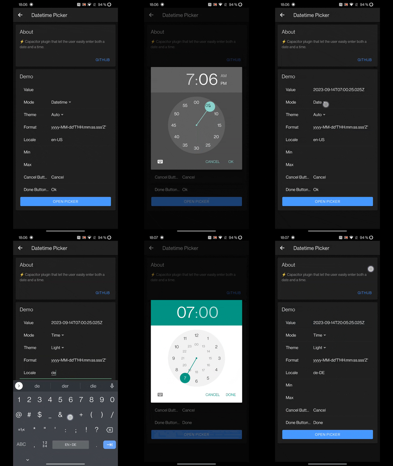
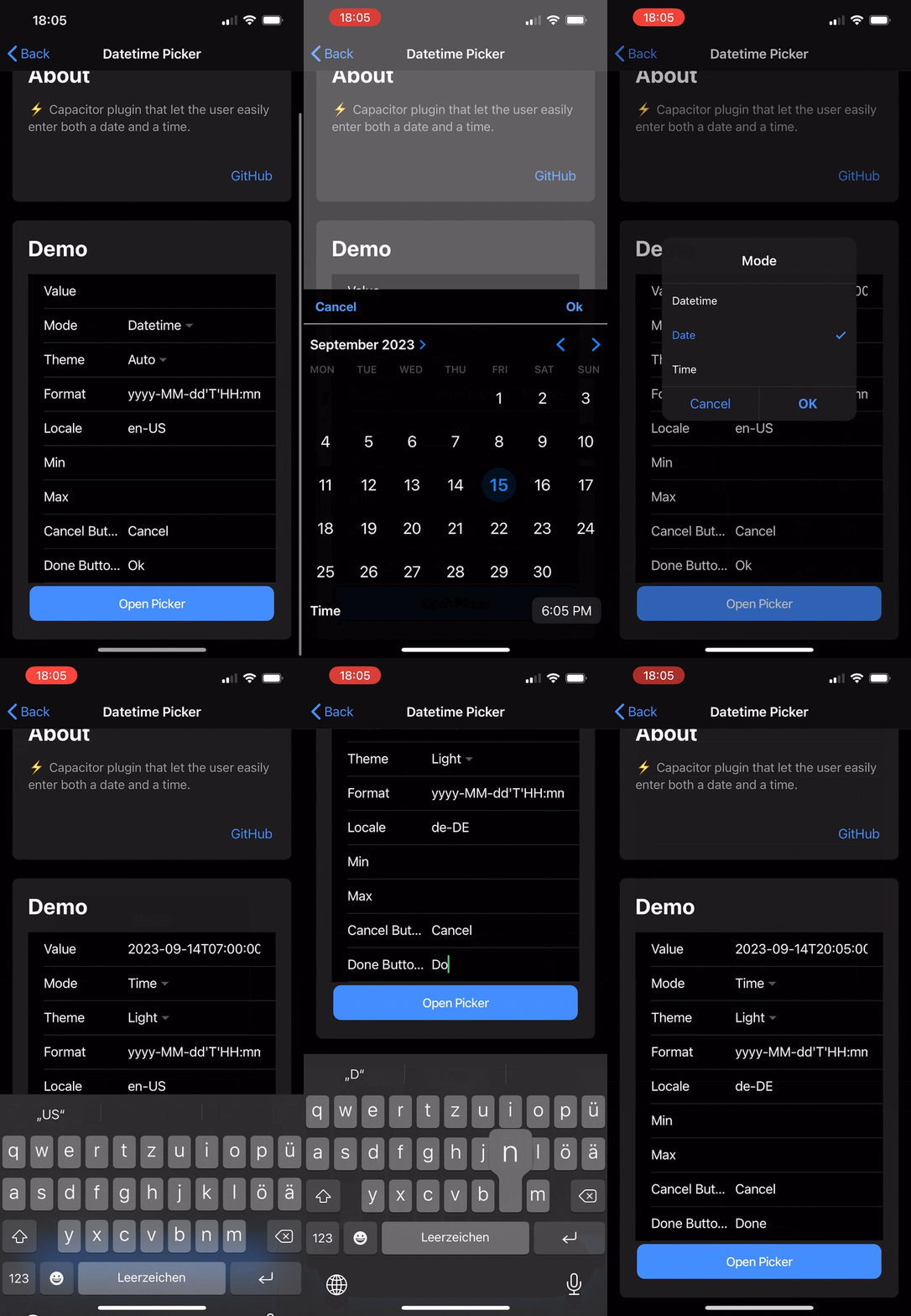
A working example can be found here: robingenz/capacitor-plugin-demo
| Android | iOS |
|---|---|
 |
 |
Usage
import { DatetimePicker } from '@capawesome-team/capacitor-datetime-picker';

const present = async () => {
  const date = new Date('1995-12-24T02:23:00');

  const { value } = await DatetimePicker.present({
    cancelButtonText: 'Cancel',
    doneButtonText: 'Ok',
    mode: 'time',
    value: date.toISOString(),
    theme: 'dark',
    locale: 'en-US',
  });

  return value;
};
API
present(...)
Open the datetime picker.
An error is thrown if the input is canceled or dismissed by the user.
Only available on Android and iOS.
| Param | Type |
|---|---|
options |
PresentOptions |
Returns: Promise<PresentResult>
Since: 0.0.1
cancel()
Cancel the currently active datetime picker.
If there is no active picker, this method does nothing.
Only available on Android and iOS.
Since: 7.2.0
Interfaces
PresentResult
| Prop | Type | Description | Since |
|---|---|---|---|
value |
string |
The value entered by the user. The format of this value matches the value of the format parameter. |
0.0.1 |
PresentOptions
| Prop | Type | Description | Default | Since |
|---|---|---|---|---|
cancelButtonText |
string |
The cancel button text. | 'Cancel' |
0.0.1 |
doneButtonText |
string |
The done button text. | 'Ok' |
0.0.1 |
format |
string |
The format in which values are received and returned. | 'yyyy-MM-dd'T'HH |
0.0.1 |
locale |
string |
BCP 47 language tag to define the language of the UI. | 0.0.2 | |
max |
string |
The latest date and time to accept. The format of this value must match the value of the format parameter. This value must specify a date string later than or equal to the one specified by the min attribute. |
0.0.1 | |
min |
string |
The earliest date and time to accept. The format of this value must match the value of the format parameter. This value must specify a date string earlier than or equal to the one specified by the max attribute. |
0.0.1 | |
mode |
'date' | 'time' | 'datetime' |
Whether you want a date or time or datetime picker. | 'datetime' |
0.0.1 |
theme |
'auto' | 'light' | 'dark' |
Choose the theme that the datetime picker should have. With auto the system theme is used. This value overwrites the theme configuration value. Only available on Android and iOS. Spinner options only available on Android |
0.0.1 | |
value |
string |
The predefined value when opening the picker. The format of this value must match the value of the format parameter. |
0.0.1 | |
androidTimePickerMode |
'clock' | 'spinner' |
Whether to use the spinner or clock mode for the time picker on Android. This value overwrites the androidTimePickerMode configuration value. Only available on Android. |
5.1.0 | |
androidDatePickerMode |
'spinner' | 'calendar' |
Whether to use the calendar or spinner mode for the date picker on Android. This value overwrites the androidDatePickerMode configuration value. Only available on Android. |
5.1.0 | |
minuteInterval |
number |
The minute interval of the time picker. This controls the granularity of the minute selector (e.g., 15 for 0, 15, 30, 45). The value must be evenly divisible into 60. Only available on iOS when using time or datetime modes. On Android, this parameter is ignored. | 1 |
7.1.0 |
Credits
The iOS implementation of this plugin is based on RPicker which is licensed under MIT.
Changelog
See CHANGELOG.md.
License
See LICENSE.
